ShopDreamUp AI ArtDreamUp
Deviation Actions
Suggested Deviants
Suggested Collections
You Might Like…
Featured in Groups
Description
Client: Debuggable Ltd., Berlin, Germany
Website: http://www.debuggable.com
Please full view to see it without the compression artefacts!
Website: http://www.debuggable.com
Please full view to see it without the compression artefacts!
Image size
650x400px 7.73 KB
© 2009 - 2024 AbhaySingh1
Comments13
Join the community to add your comment. Already a deviant? Log In
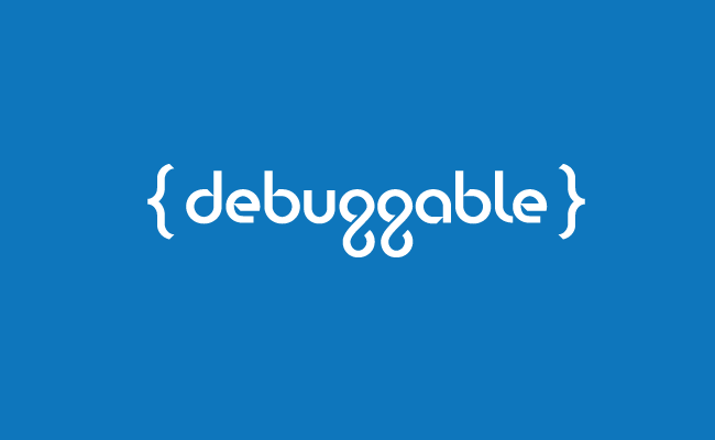
First of all, I commend you in taking the plunge and designing your own typography. That's a daunting task for most people and 9 times out of 10 it turns out horribly, but I think the type you built is clean and quite legible, so good work on that front.
That said, I think the lowercase g's need some work. They closely resemble figure-8's, which doesn't make much sense to me. Despite this, one might argue that the g's make this logotype unique and ownable, but I think you can make some subtle improvements and still have an ownable logotype.
Additionally, the terminal on the lowercase L probably isn't necessary, and looks out of place amongst the rest of the type. I would eliminate it and leave the L as a straight line. I also have to mention the way the strokes terminate on the lowercase g's: they have this subtle hook to them that doesn't match what you've done with the rest of the glyphs (and how they have an angular cut).
I'm not too sure what the brackets are meant to represent to a lay person. As a person who dabbles in code authoring I recognize them as a core element of CSS but otherwise they're just little brackets and they don't communicate much. You might not even need them if you're happy and content with the simple typography.
Anyway, pretty nice work. I think some more attention to the letterforms could result in a more refined-looking piece, but overall I think it's good stuff. <img src="e.deviantart.net/emoticons/s/s…" width="15" height="15" alt="


